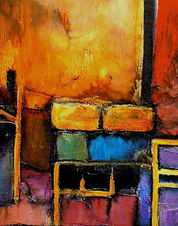


This is a larger version of the DSFDF photo of city roof tops. The first version I did is much smaller and is a mixed media piece - see blog entry of 10/18/2009. This one is on canvas and it simply acrylic paints and modeling compound . I've been working on this painting for about two weeks and it has undergone numerous transformations. I am finally happy with the result.
Being an abstracted version of the photo, it is all about patterns, negative space, and focal point. As you can see the complexity of the shapes increases to the right and slightly below the middle of the painting. Rotating the painting to a vertical format yields an equally interesting composition.
The colors evolved on their own. The reference photo was mostly subtle tones of blue, grey and yellow. Most of my work is not subtle in terms of palette! I love strong value contrasts so I was able to go nuts with this one.
For purchase information, please see my website.
9 comments:
DROP DEAD BEAUTIFUL.. WOW CAROL!!!
k. Madison Moore
www.kmadisonmoorefineart.com
http://kmadisonmoore.blogspot.com
Carol, This is an absolutely wonderfully creative version of the picture. I like it much better!! As always your colors and execution are masterful!!
This is a great treatment of this photo, Carol.
Very rich stuff!
This is terrific, Carol. The hard darks, the texture, and the variation in intensity within the different color areas area all beautiful. A really wonderful interpretation of the challenge.
You knocked it out of the park!
Wonderful painting!! Love your interpretation of the photo.
This is a very unique idea, Carol!
An abstract cityscape of just the roofs!
Neat!!
-Dean
I could not have said it any better than Madison, "Drop Dead Beautiful!"
I love seeing how your styles are not set in stone and you're always reaching outside the box.
Love your take on this difficult assignment. Great colors and I like the way you pushed the abstract shapes!
Post a Comment