 | |
| Daily Races |
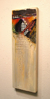
I'm not sure how I feel about this painting. It has a lot of mixed media materials in it - I'm just not sure if I've arranged them in a successful composition.
This painting is a perfect example of why abstract painting can be so difficult and frustrating. When you don't know what the end result is SUPPOSED to look like, you can find yourself adrift on an endless sea of possibilities.
What if I try this? or that? At one point this entire canvas was blue! In good times, the painting takes on a life of it's own and TELLS the artist what direction to go in.
This painting was totally mute. It didn't tell me anything. It just sat there pouting and petulant. Every step was a struggle. It may have to sit in my studio for a while longer until it decides to talk to me.
For more information on this petulant painting, click here to go to my website.


5 comments:
Carol, I'm most certainly not an expert in abstract...but I was so excited to click larger on this piece. The contrast up top is awesome and drew me right in. The blue coming through down below is so nice...so I don't have any thoughts, but it seemed a great composition to me...the diagonals give that awesome tension...the checkerboard on an angle serve to strengthen that feeling of movement...and the movement of texture below seem right...but, like I said I'm a novice in this! I personally LOVE it...:)
Saundra - I like it better just from reading your analysis! Thanks for your very thoughtful comments - you sound like an expert to me.
Cool! I'm always delighted to see any of your new work. You inspire me.
I am not an expert on abstract paintings either but this one certainly draws one's attention to it. I like this one.
Carol, I think this one has definitely "spoken" with a loud voice! I think the composition is great and I love the juxtaposition of shapes at the top with the wide open area in the lower area of the painting...keep up the great work!!
Post a Comment